Fresh Ideas for Your Home – Pantone Colors 2016
 Rose Quartz and Serenity are the colors of the year, according to the Pantone Color Institute.
Try using these calming shades of pink and blue in your interior plan.
The Pantone Color Institute has selected two shades – Rose Quartz and Serenity – as their colors of the year for interiors. Each year, Pantone selects a color that expresses a mood and an attitude for the year; and this is the first time the organization has selected two shades as a color of the year!
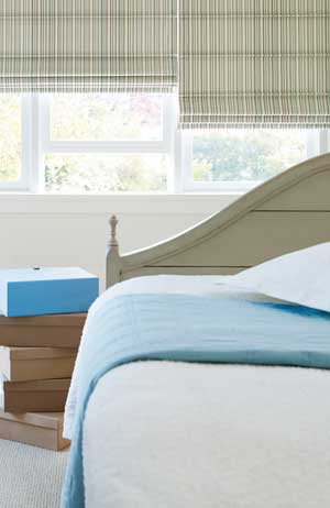
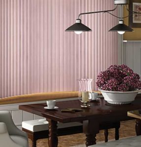
These soft shades of calm blue and serene pink make us feel more secure and at peace. When used in home décor, they add to our sense of well-being, helping take away the daily stresses of life in our own home environments.
“Joined together, Rose Quartz and Serenity demonstrate an inherent balance between a warmer embracing rose tone and the cooler tranquil blue, reflecting connection and wellness as well as a soothing sense of order and peace.”
— Leatrice Eiseman
 Leatrice Eiseman is the Executive Director, Pantone Color Institute®. “Rose Quartz is a persuasive yet gentle tone that conveys compassion and sense of composure, while Serenity is weightless and airy, like the expanse of the blue sky above us, bringing feelings of respite and relaxation even in turbulent times.”
Whether you use each color alone or use them together in your home environment, this year think Rose Quartz and Serenity for upholstery and drapery fabrics, rugs and carpeting, paint, tile and backsplashes, bed and table linens, and accessories.
Soften your home environment this year by decorating in Rose Quartz and Serenity.