Fresh Ideas for Your Home – Complementary Colors
Complementary Colors Beautifully Finish Almost Any Design Plan
 Use them for harmony and a sense of calm.
The old adage that opposites attract is often true, and especially in selecting the colors for decorating your home. Using opposite colors (also known as complementary colors) adds energy to a room, yet at the same time, makes us feel comfortable and complete.
Complementary colors are the shades that are opposite on a color wheel:
- Red and green
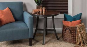
- Orange and blue
- Purple and yellow
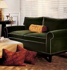 Nature is full of complementary colors, such as dramatic red roses on stems with bright green leaves, delicate pansies with their purple and yellow color combination, and bright blue sky and sea positioned near golden sand.
For a more modern take on complementary colors, you can use shades that are not exactly across the color wheel, or you can be a bit creative with the complementary color concept. Think about innovative hues like:
- Sky blue and terra cotta
- Pink grapefruit and acid green
- Burnt orange and sage green
- Soft aqua blue and tomato red
If you feel cautious about adding complementary colors, start small with elements like a painted wall, sofa pillows, throws, flower arrangements or slipcovers. Then, as you become more confident, you can ratchet up your color scheme with larger and more permanent items like upholstery fabrics and window fashions.
Balance your interior design plans beautifully by selecting complementary colors.